Rebranding – Twitter Home/Feed
I’ll admit, I’ve always had a tough time navigating Twitter. So I decided to redesign it in a way that I felt made it more user friendly and modern.
This is my redesign of Twitter’s home page/twitter feed. The layout has changed a bit, but the website is still familiar enough.
Placeholder images are from Unsplash.
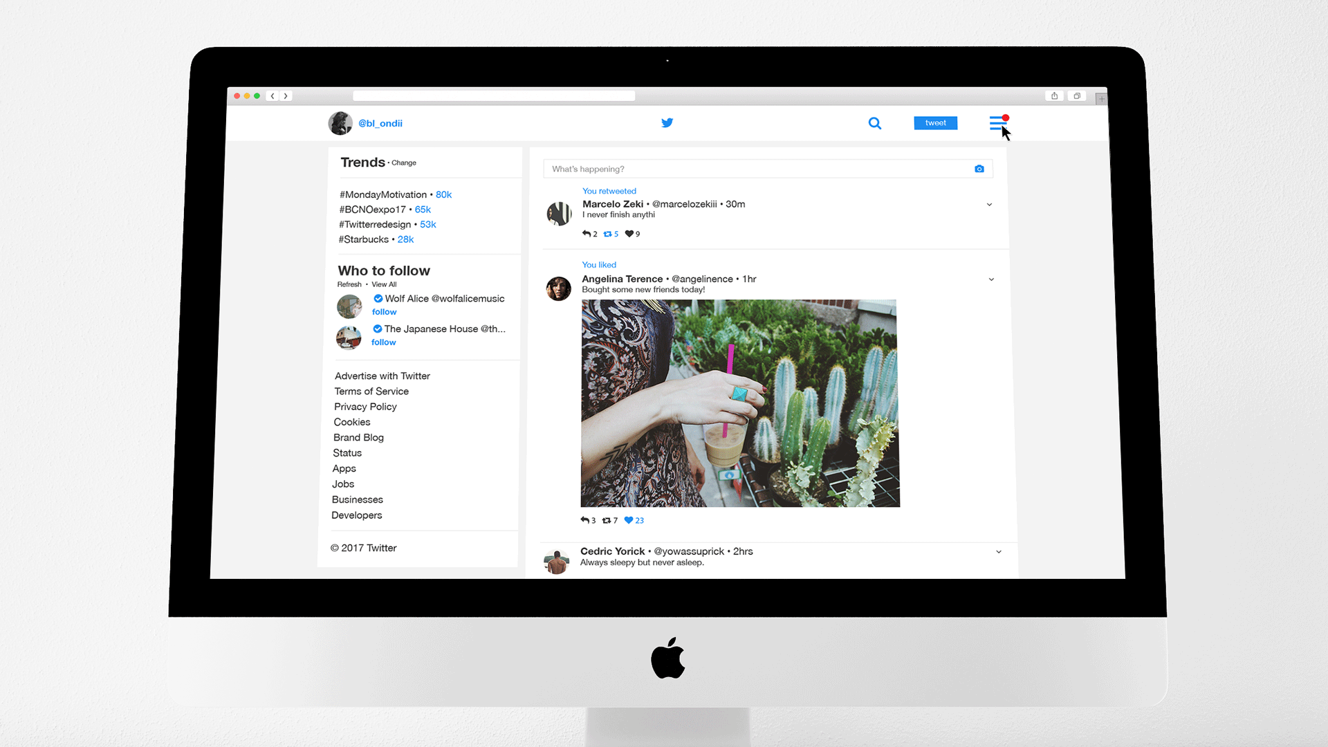


The classic Twitter blue has stayed the same, as well as the slightly boxy feel. However, removing borders and brightening up the background gives the site a new, clean look. Using the blue as a clear accent colour helps the user navigate the website, and the feed has been decluttered.
Menu items that need to be accessible, but that aren’t as important to your basic Twitter user have been tucked way, and organized in a vertical list, rather than one after the other.
The website now features a sidebar menu, that holds all of the original quick menu from the website, and more. Bolding is utilized to make certain elements stand out, as well as type hierarchy.
Please leave your feedback below, and let me know what you think of my redesign!